


This section discusses the immediate subclasses of choice which can be used to build button panels. If you have a group of several buttons, you can use the appropriate button-panel element to specify them all as a group, rather than using push-button or check-button to specify each one separately. There are three such elements altogether: push-button-panel, check-button-panel and radio-button-panel. The specifics of each are discussed below.
The arrangement of a number of push buttons into one group can be done with a push-button-panel. Since this provides a panel of buttons which do not maintain a selection when the user clicks on them, push-button-panel is a choice that does not allow a selection. When a button is activated it causes a :selection-callback, but the button does not maintain the selected state.
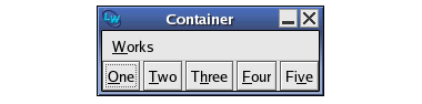
Here is an example of a push button panel:
(setq push-button-panel
(make-instance 'push-button-panel
:items '(one two three four five)
:selection-callback 'test-callback
:print-function 'string-capitalize))
(contain push-button-panel)
Figure 5.1 A push button panel

The layout of a button panel (for instance, whether items are listed vertically or horizontally) can be specified using the :layout-class keyword. This can take two values: 'column-layout if you wish buttons to be listed vertically, and 'row-layout if you wish them to be listed horizontally. The default value is 'row-layout. If you define your own layout classes, you can also use these as values to :layout-class. Layouts, which apply to many other CAPI objects, are discussed in detail in Laying Out CAPI Panes.
A group of radio buttons (a group of buttons of which only one at a time can be selected) is created with the radio-button-panel class. Here is an example of a radio button panel:
(setq radio (make-instance 'radio-button-panel
:items (list 1 2 3 4 5)
:selection-callback 'test-callback))
(contain radio)
Figure 5.2 A radio button panel

A group of check buttons can be created with the check-button-panel class. Any number of check buttons can be selected.
Here is an example of a check button panel:
(contain
(make-instance
'check-button-panel
:items '("Red" "Green" "Blue")))
Figure 5.3 A check button panel

On Windows and GTK+ you can specify the mnemonics (underlined letters) in a button panel with the :mnemonics initarg, for example:
(contain
(make-instance 'push-button-panel
:items '(one two three many)
:mnemonics '(#\O #\T #\E :none)
:print-function 'string-capitalize))
The panels inherit the callbacks functionality from callbacks, most importantly the selection-callback and retract-callback , which are used as the default callbacks for the buttons.
The
items
functionality of button panel is inherited from collection. Typically you just use the initarg :items to specify the items, but in principle you can set the items dynamically. The other important functionality from collection is the
print-function
to define the strings that are displayed in the buttons.
Accessing the state of the buttons in check-button-panel and radio-button-panel is done by the selection functionality that is defined on choice. For example, making a check-button-panel with four buttons and the last is selected, and after two seconds selecting the first and the third:
(progn
(setq cbp
(capi:contain
(make-instance 'capi:check-button-panel
:items '(1 2 3 4)
:selected-item 4)))
(sleep 2)
(capi:apply-in-pane-process
cbp
#'(lambda ()
(setf (capi:choice-selected-items cbp)
'(1 3)))))
All the button panel classes inherit from button-panel, which defines all the functionality of button panels. This includes a mechanism for specifying the layout of the buttons, images for the buttons, mnemonics, and also default and
Cancel
button. It also has an initarg :callbacks to define an individual selection callback for each item.
The function set-button-panel-enabled-items is used dynamically to enable/disable individual items in a panel.
For more control over individual buttons, some (or all) of the items in a panel may be buttons themselves (that is, instances of a subclass of button). The behavior on an item that is actually a button is controlled by accessing the button.
CAPI User Guide and Reference Manual (Unix version) - 3 Aug 2017