


The example below uses three predefined panes, which need to be defined as follows:
(setq red-pane (make-instance 'output-pane
:background :red))
(setq green-pane (make-instance 'output-pane
:background :green))
(setq blue-pane (make-instance 'output-pane
:background :blue))
A switchable layout allows you to place CAPI objects on top of one another and determine which object is displayed on top through Lisp code, possibly linked to a button or menu option through a callback. Switchable layouts are set up using a switchable-layout element in a make-instance. As with the other layouts, such as column-layout and row-layout, the elements to be organized are listed in the
description
slot, initialized in this example by the :description initarg::
(setq switching-panes (make-instance
'switchable-layout
:description (list red-pane green-pane)))
(contain switching-panes)
Note that the default pane to be displayed is the red pane, which was the first pane in the description list. The two panes can now be switched between using switchable-layout-visible-child:
(apply-in-pane-process
switching-panes #'(setf switchable-layout-visible-child)
green-pane switching-panes)
(apply-in-pane-process
switching-panes #'(setf switchable-layout-visible-child)
red-pane switching-panes)
A tab-layout displays several tabs, and a single pane which contains the main contents.
In its simplest mode, a tab-layout is similar to a switchable layout, except that each pane is provided with a labelled tab, like the tabs on filing cabinet folders or address books. If the tab is clicked on by the user, the pane it is attached to is pulled to the front. Remember to close the switchable layout window created in the last example before displaying this:
(setq tab-layout
(make-instance 'tab-layout
:items (list (list "one" red-pane)
(list "two" green-pane)
(list "three" blue-pane))
:print-function 'car
:visible-child-function 'second))
(contain tab-layout)

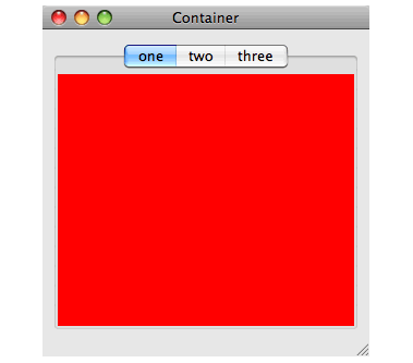
The example needs the :print-function to be car, or else the tabs will be labelled with the object numbers of the panes as well as the title provided in the list.
However, a tab layout can also be used in a non-switchable manner, with each tab responding with a callback to alter the appearance of only one pane. In this mode the :description keyword is used to describe the main layout of the tab pane. In the following example the tabs alter the choice of starting node for one graph pane, by using a callback to the graph-pane-roots accessor:
(defun tab-graph (items)
(let* ((gp (make-instance 'graph-pane))
(tl (make-instance 'tab-layout
:description (list gp)
:items items
:visible-child-function nil
:print-function (lambda (x) (format nil "~R" x))
:callback-type :data
:selection-callback #'(lambda (data)
(setf (graph-pane-roots gp)
(list data))))))
(contain tl)))
(tab-graph '(1 2 4 5 7))
You can access the pane that is currently displayed in the tab-layout by tab-layout-visible-child, and you can obtain a list of the panes that have been displayed by calling tab-layout-panes.
If you need adjacent panes in a row or column to have a narrow user-movable divider between them, supply the special value :divider in the
description
. The divider allows the user to resize one pane into the space of the other. To see this in the column layout below, grab the divider between the two panes and then drag it vertically to resize both panes:
(contain (make-instance 'column-layout
:description (list green-pane
:divider
red-pane)))
The arrow keys can also be used to move the divider.
To include a narrow visible element between adjacent panes which cannot be moved (dragged) by the user, supply the special value :separator in the
description.
If you also specify ratios, the ratio for each occurrence of either of these special values should be nil to specify that the narrow element is fixed at its minimum size:
(contain (make-instance 'column-layout
:description (list
(make-instance 'output-pane
:background :red)
:divider
(make-instance 'output-pane
:background :white)
:separator
(make-instance 'output-pane
:background :blue))
:y-ratios '(1 nil 4 nil 1)
:title "You can drag the divider, but not the separator"
:background :gray))
Dividers and separators can also be placed between panes in a row-layout or even combinations of row and column layouts.
static-layout is a layout that simply places each of its children where the geometry specifies (
x
,
y
,
visible-min-width
and
visible-min-height
). The children can be moved and resized by (setf static-layout-child-position) and (setf static-layout-child-size).
An important subclass of static-layout is pinboard-layout, which is documented in Creating graphical objects. pinboard-layout is used to create your own kind of panes.
Your interface can have a toolbar which the user can configure by selecting and rearranging the buttons to display. To implement this, specify an interface toolbar as described in Adding Toolbars.
docking-layout allows docking/undocking of panes, which means interactively moving the panes between places in the interface (docking) and into standalone floating windows (undocking). The full functionality is available only on Microsoft Windows, while GTK+ gives very limited functionality. On Cocoa it is completely static. Docking layouts are especially useful for toolbars, but can contain other panes.
To allow moving a pane between different places in the interface, you need to group several docking-layouts. This done by using make-docking-layout-controller to create a controller object, and then passing the controller when making the docking-layout with the initarg :controller. You then place each docking-layout in a different place in the interface, by including it in the layout hierarchy of the interface in the usual way, and then it is possible to interactively move panes between all the docking-layouts that share the controller.
If you merely want to allow undocking, you do not need a controller.
The function docking-layout-pane-docked-p can be used to test whether a pane is docked in a specific docking-layout, and can be used with cl:setf to programmatically dock a pane in a specific docking-layout or to undock it (to do this, dock it to nil).
The function docking-layout-pane-visible-p can be used to test whether a pane is docked in one of the docking-layouts in the group of a docking-layout (that is, layouts with the same controller) or is undocked, and the docking-layout or the floating window is visible. It can be used with cl:setf to change the visibility of the docking-layout (if the pane is docked) or the floating window (undocked).
(example-edit-file "capi/layouts/docking-layout")
In LispWorks for Windows, the CAPI supports MDI through the class document-frame. MDI is not supported on other platforms.
To use MDI in the CAPI, define an interface class that inherits from document-frame, and use the two special slots capi:container and capi:windows-menu as described below.
In your interface's layouts, use the symbol capi:container in the
description
to denote the pane inside the MDI interface in which child interfaces are added.
document-frame-container is a reader which returns the document-container of the document-frame.
Interfaces of any type other than subclasses of document-frame may be added as children. To add a child interface in your MDI interface, call display on the child interface and pass the MDI interface as the
screen
argument. This will display the child interface inside the container pane. To obtain a list of the child interfaces, call the screen reader function screen-interfaces, passing the frame's document-container as the
screen
argument.
You can use most of the normal CAPI window operations such as top-level-interface-geometry and activate-pane on windows displayed as children of a document-frame.
The slot capi:windows-menu contains the Windows Menu, which allows the user to manipulate child interfaces. The standard functionality of the Windows Menu is handled by the system and normally you will not need to modify it. However, you will want to specify its position in the menu bar. Do this by adding the symbol capi:windows-menu in the :menu-bar option of your define-interface form.
By default the menu bar is made by effectively appending the menu bar of the document-frame interface with the menu bar of the current child. You can customize this behavior with merge-menu-bars.
This example uses document-frame to create a primitive cl:apropos browser.
Firstly we define an interface that lists symbols. There is nothing special about this in itself.
(capi:define-interface symbols-listing ()
((symbols :initarg :symbols))
(:panes
( symbols-pane capi:list-panel
:items symbols
:print-function
'symbol-name))
(:default-initargs
:best-width '(character 40)
:best-height '(character 10)))
Next we define the MDI interface. Note:
capi:container is used in the layout description.capi:windows-menu is in the :menu-bar list.Otherwise, this example uses standard Common Lisp and CAPI functionality.
(capi:define-interface my-apropos-browser
(capi:document-frame)
((string :initarg :string))
(:panes
(package-list
capi:list-panel
:items
(loop for package in (list-all-packages)
when
(let ((al (apropos-list string package)))
(when al
(cons (package-name package) al)))
collect it)
:print-function 'car
:action-callback
#'(lambda (mdi-interface name-and-symbols)
(capi:display
(make-instance
'symbols-listing
:symbols (cdr name-and-symbols)
:title (car name-and-symbols))
:screen mdi-interface))
:callback-type :interface-data)
)
(:menu-bar capi:windows-menu)
(:layouts
(main
capi:row-layout
'(package-list :divider capi:container)
:ratios '(1 nil 4)))
(:default-initargs
:visible-min-height '(character 20)
:visible-min-width '(character 100)))
To browse apropos of a specific string
(capi:display
(make-instance 'my-apropos-browser
:string "EDITOR"))
CAPI User Guide and Reference Manual (Macintosh version) - 25 Feb 2015